
|
|
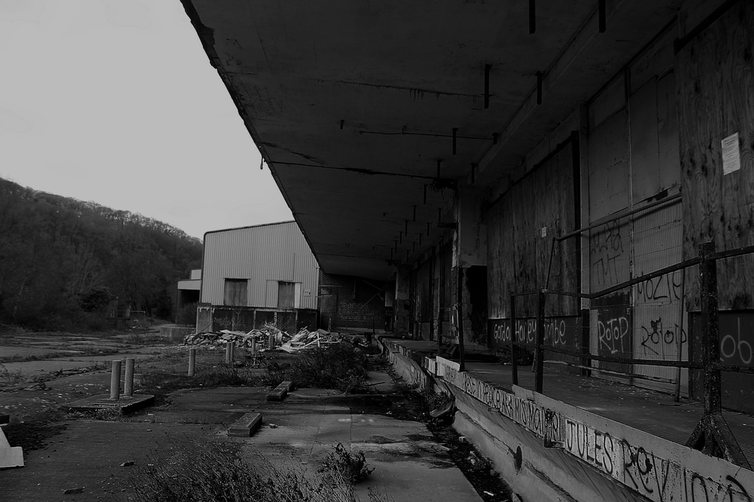
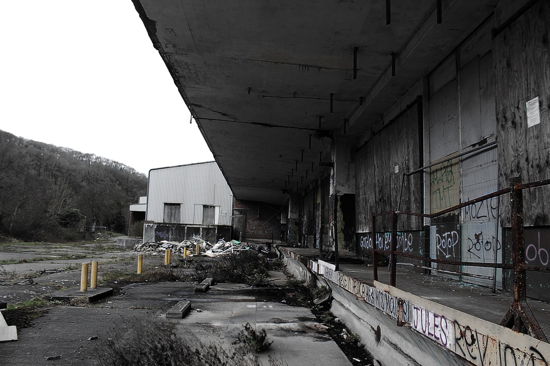
For these two edits on the left i tried to recreate the look of John Riddy's work by creating edits of similar scenery that he would of captured. To edit the photo i started by turning them black & white and changing the default settings by playing with the sliders to enhance certain colours like the greens and reds. doing this created much dark tones throughout the image, to further this i use a curves layer to fine tune the light and shadows and get the tone just right. i repeated this process for the second edit as well. I felt that this is all i need to do as the photos on there own were already powerful so they didn't need much in the way of editing. im pleased with how these edits turned out and i like how simple but powerful they are. For the two on the right i have used the same images but edited them in a different way to inspired by his colour work. I found that his colour in his work was very mute and the way he had shot his image gave them great composition to strengthen the lack of colour, so to recreate this i started by using the smart sharpen to make the image crisp then began to turn the vibrancy down using layer adjustments. when doing this i found that to colour pallet became too narrow so to widen it. I then created a layer mask on the vibrance adjustment and began using the eraser with a low opacity to keep the muted colours but have a wider variety.
|
|
